This is an import from my own blog post in 2015 when I open-sourced my Vim color scheme that had received a warm welcome from many Vim users and inspired others to port to different platforms and create different UI projects. This was before Visual Studio Code/Atom era, and yet, there are even more Vim users now as I see the number of downloads grow higher every day. PaperColor currently gets 1500+ downloads every 2 weeks.
After years of improvements since the last release, I think it’s time for PaperColor to reach an official 1.0 release.
Below is the story behind PaperColor copied from the original post.
I started using Linux and Vim last Summer, and one of the first things I did in Vim, as I would do in any code editor, was to find a decent color scheme. I was surprised by how useful and colorful the terminal could be. Coming from Windows background, I realized how much I missed out. In the beginning, I was happy with the themes I found, but as soon as I worked with less mainstream languages, most of the themes don’t work well enough. Or, some work on these languages but not on the others, so I had to switch theme based on the language I was programming, and it quickly became annoying. So, I decided to create my own color scheme.
https://github.com/NLKNguyen/papercolor-theme

(More screenshots at bottom)
I design this light color scheme for terminal Vim and gVim, and I call it Paper Color. It is inspired by Google’s Material Design. It is designed to be visually appealing, playful, bold, and high contrast yet pleasant for the eye.
The goal is of course to improve readability, but I also focus on presentation ability. That is the main reason I chose to design a light color scheme instead of dark. I like dark color schemes, but for practical purposes, light ones work better in more places. For instance, when doing code walk-through with a screen projector in a presentation, it is very very unlikely that the projector can project the background of a dark theme to be dark enough to make the code stand out like on the monitor screen, thus resulting in muddy syntax colors that reduces the code readability of the audience. Of all presentations that I have been to, the light color schemes always perform better.
I create this color scheme based on the famous Tomorrow theme because I find its code to be better organized than other themes that I have tried, which make it easy to learn and modify. More importantly, unlike many themes, it already displays well on both terminal and GUI Vim, so it makes sense for me to simply work from there.
Right now, It is specifically designed for 20+ languages. Visit the Github page to see the list of syntax highlighting plugins that this color scheme supports.
https://github.com/NLKNguyen/papercolor-theme
Installation
With Vundle plugin manager
Plugin 'NLKNguyen/papercolor-theme'
Or manually
$ git clone https://github.com/NLKNguyen/papercolor-theme
$ cp papercolor-theme/colors/PaperColor.vim ~/.vim/colors/
Then, put this in your ~/.vimrc
Light version:
colorscheme PaperColor
Dark version:
colorscheme PaperColor-Dark
I hope you like it 🙂 Any comment/suggestion/question is welcome.
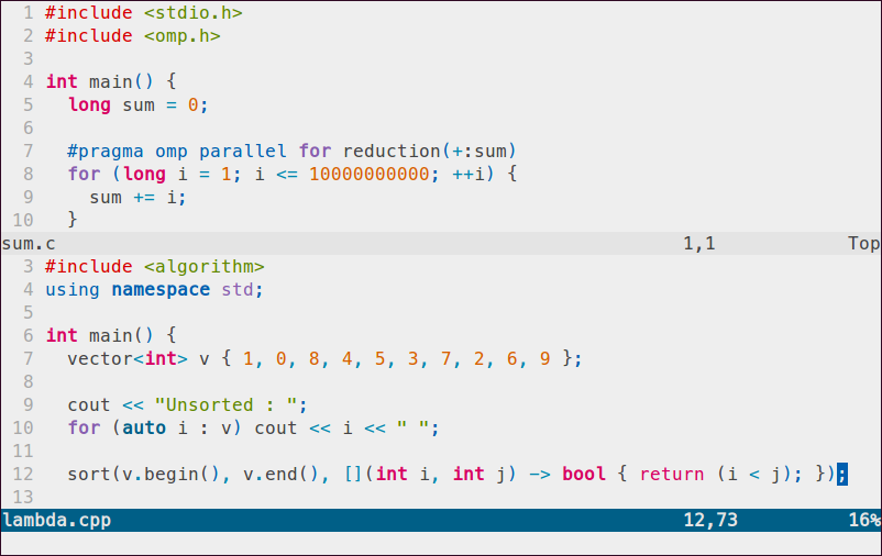
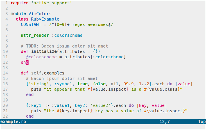
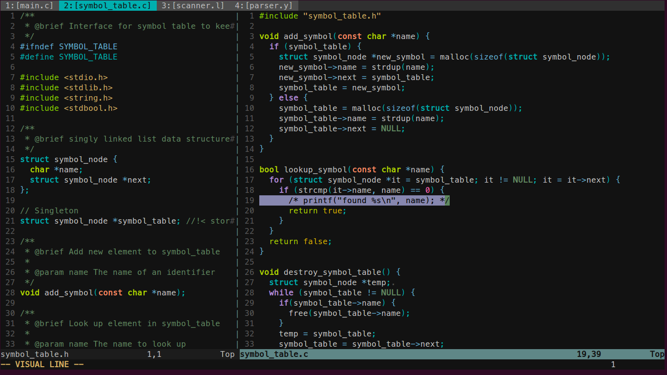
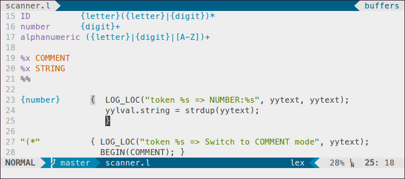
Here are the screenshots for different languages. I will update them occasionally. In the meantime, check out post updates and users’ creations inspired by this below the screenshot gallery.


Update May 31, 2015: Bringing PaperColor theme support to Vim-airline.
let g:airline_theme='papercolor'
See what others have done based on Paper COlor design
Christoph Hermann designs a very good looking iTerm2 theme called material-iterm that has both light and dark variants.


Reddit user fixles creates a Terminal theme that matches Paper Color very nicely, and it looks beautiful when you use tmux.

Let me know what you have created with this design 🙂
See more discussion about this post on Reddit!
Creator and author at DEPHONY. I develop open-source/free software and write technical tutorials that are straight to the point to save readers’ time to learn and apply. Support my work by becoming a Patron 🙂